BoBo - order with a friend

BoBo, a fictional bubble tea chain in California, wants to increase sales for new and regular customers by bringing a personalized ordering experience into their home (amid quarantine restrictions).
Both new and regular customers are presented with so much choice and cannot see each other. How can we ease their cognitive overload with personalized recommendations using AI while maintaining an authentic ordering experience?
Identify the core issue of personalizing bubble tea suggestions in a beginner-friendly task flow. The use of AI is limited as a nice-have. Develop "Order with a Friend" - a brand new collaborative order experience with another user.
My role: Background research, competitive analysis, mid- & hi-fi prototyping
Collaborator(s): UX Designer Kristen Ha
Figma
Miro
Zoom
Google Drive
From a business perspective, the popular (fictional) bubble tea chain Bobo wants to increase the number of new users and retain them with new stimuli (like new flavours). Jeremiah has never had bubble tea but wants to try after seeing his friends’ photos of previous outings at the bubble shops. Ngoc, on the other hand, has had bubble tea for ages, back in middle and high school, but wants to try something new that she would like.


My personal experience with delivery apps like GrubHub gave me an understanding of the convenience of home delivery, but at the cost of added delivery fees and inability to get the same in-shop experience.
%20(1).png)
All the competitors sought to make food consumption convenient from any place. However, they all focused on the individual with limited customization abilities.
My partner Kristen Ha came into the project to help me with research onwards. Our research topics were informed by our background research into the topic of AI in design and how it can help introduce new products to the users, e.g. Netflix or Amazon. Although AI was the backbone of such platforms, we wanted to focus on what the users actually wanted from a bubble tea shop - what attracts them, what informs their buying decisions.
On top of 31 survey responses, 5 users volunteered ranging from people with no direct experience with ordering/drinking boba to experts who have ordered bubble tea from different places for years. This was important to us, as this sample better represented the diverse users of the app.
Data synthesis revealed 4 key insights:

At this point we realized that although making personalized suggestions is important for more experienced customers, what they actually need is the in-shop experience with other people.
To better accommodate our respective schedules, I found it best to give each of us a day to think and brainstorm ideas. A 1-hour workshop followed to bring the ideas together, synthesize and prioritize into a value prop canvas based on our conducted research.

We focused on two points for our value proposition:
Due to the social and emotional experience that bubble tea shops have created, instead of individual user stories we found it best to map out Ngoc and Jeremiah's experiences. This method was not just useful as a skeleton to build our user flow on, but it also forced us to start thinking about solidified features that would inhabit this app, e.g. setting up likes/dislikes in onboarding and inviting contacts to order together.

We borrowed much of the onboarding flow (1) from Spotify. BoBo's unique features include sign-up with a phone number (thus binding to the device they'll use in the app). When testing the first prototype, the users indicated a preference for push notifications over e-mail and SMS communications as they cannot be sure it will be relevant or intrusive.

We started with a simple "split" flow (2-3) for the shared ordering experience "Order with a Friend" to augment real-life boba ordering where friends can split the bill with added monetary reward incentives and deliver to separate addresses. However, testing will reveal that it is not the only way users want to order with others.

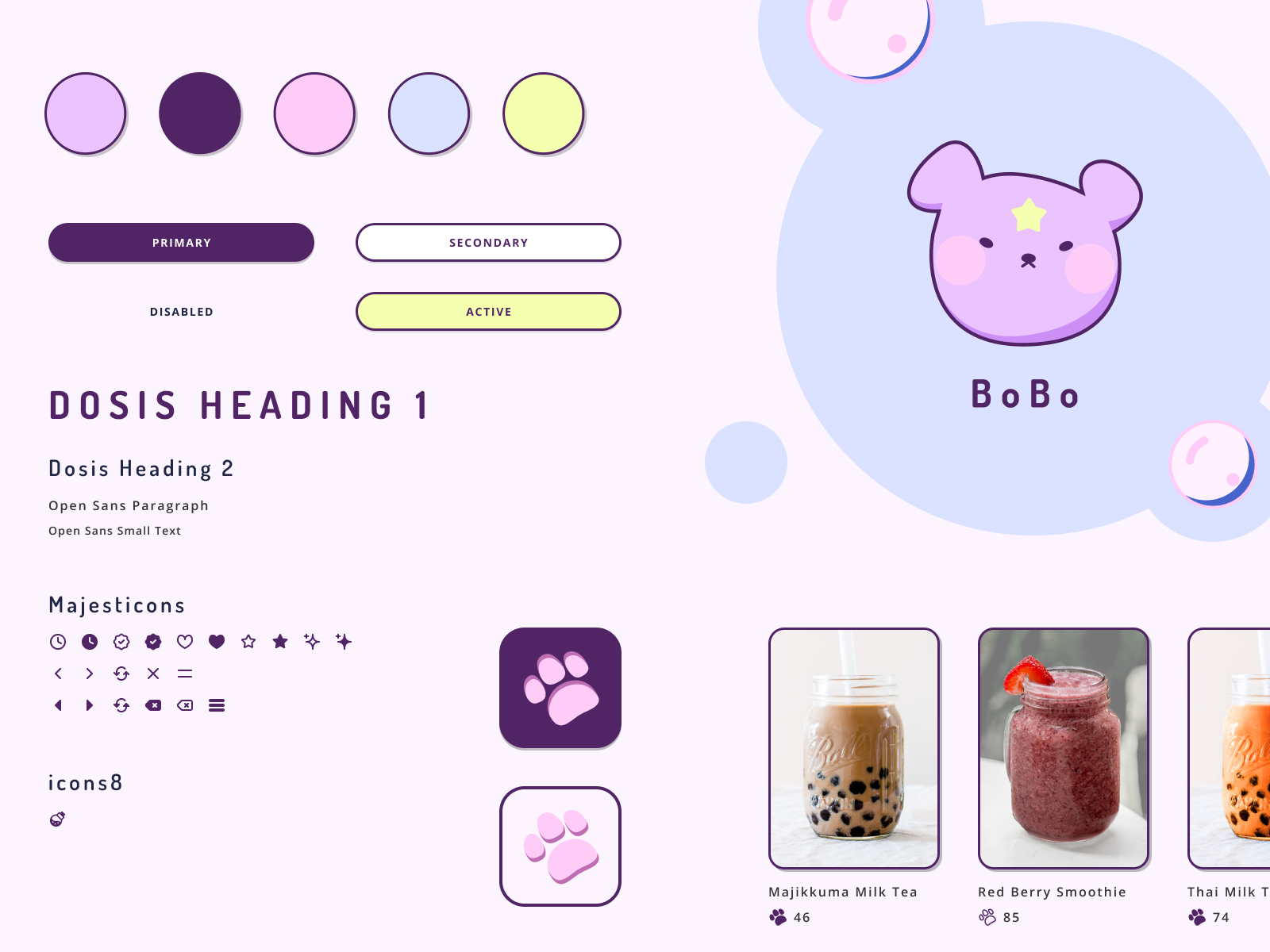
I was fascinated with the witchcraft theme as it also involves brewing liquids but wanted to make it appealing to a younger audience with pastels. I struggled to balance the milk tea-like pastels with the magical items but I am happy with how the bear mascot turned out!
2 rounds of 5 usability tests were conducted with the help of family, friends and interview participants that showed interest. We tried to balance our sample by looking for people with varied bubble tea experience. You can find detailed script notes here.
During the first round, we were surprised by how seemingly evident some icons can be but not clear in the task's context. The Friends tab uses the clock icon to indicate whether there is a pending invite acceptance. But it was also used for pending order invite requests when the invited party has not replied to your request.
Other feedback include:
The preference set-up (likes and dislikes) were split into two screens with dislikes being optional. This simplified the interaction with the screen to tapping and scrolling down.


Introduced the option to order and pay for someone else. Second round confirmed the users' preference to pick this option when presented a choice to split or pay for someone else. Clear limitation to 1 friend was added to reduce complexity.


Live updates were added for "split" orders. This way, the initiator knows exactly when their friend has finished ordering to sync orders or communicate with each other regarding the order.


Originally, we aimed to solve the issue of reduced bubble tea intake by creating a beginner-friendly bubble tea experience through an AI-powered delivery app. Our final product showcases the developments described above and will be best displayed through the boba newbie Jeremiah's user story first, then boba veteran Ngoc's.
Jeremiah is curious about this unknown product and has seen a couple of BoBo shops around his area.

He knows there is some points system from logging in - much like collecting stamps. He can expect non-intrusive, functional push notifications. Classics sound good though - must be liked by most and is a safe choice for a newbie.

Jeremiah likes that extra creamy texture so adds some cheese foam on top of the famed boba pearls. It's kind of chilly - just a bit of ice is enough. Can't say much about how sweet it is so let's stick to the default. The customization is easy to follow and the menu section takes up most of the space to see more choices at the same time!

Can't forget to add an extra for his significant other. He checks out the sliding menu which makes it easy to edit the customization choices or completely remove from the cart. Enabling location allows him to skip putting in the address and getting a better delivery time estimate. Additionally, the fast pay options are displayed prominently at the top to encourage finishing checkout.
Now Jeremiah can relax until his delicious bubble tea arrives at his doorstep!

Ngoc is watching a movie with her friend Ashley through a Discord stream as Ashley quarantines. She wants to order boba for them to make it feel more like a real outing and as a thank you for organising the stream.
Ashley has never heard of BoBo so Ngoc does her best to convince her to try as she definitely knows her bubble tea. She sends an invite to Ashley's mobile number. Ashley presses the link to download and sign up her BoBo account.

Ngoc gets extra points for inviting her friends which she's stoked about. Now for the main event - let's order some bubble tea for herself and Ashley!
She picks to pay for the whole order. When her friend accepts the order invite, the app can confirm that this is a real user with an address to deliver to. Ngoc orders as per usual.

Out of habit, Ngoc presses "Checkout" before she selects Ashley's drink. But BoBo got her and reminds her to do that. Once both sides confirm their addresses, the app will calculate their savings (in this case, the same flagship store results in free delivery) and both friends earn points!

My biggest challenge was changing the problem in front of me. This study has shown that users want the authentic bubble tea experience as it holds socioemotional value to them - a premise to hang out with family/friends.
While my early assumptions biased me towards focusing on the "recommendations" that can be solved by AI, the data proved me wrong. This case study has implications beyond improving the delivery service during quarantine regulations. This could significantly improve BoBo's accessibility by bringing the human side of a bubble tea shop to immunocompromised users and those with special needs.
I was also challenged by the interactive design as its creative direction and hi-fi execution was all individually completed. While the direction of pastel, witchcraft-inspired design stayed the same, it was only after my summer internship at Mindgrub did I learn more on how to clearly set the UI direction in a way that reflects the product. As a result, I am extremely happy with how cute, retro-inspired BoBo turned out to be! It would not be as realistic should it has been a UX improvement sprint for an existing bubble tea chain, however, that was not part of the study limitations.

