
Mindgrub is a design-consulting agency that takes up stand-alone projects as well as long-term clients, mostly energy companies, to build or redesign their digital products.
The client commissioned the design team to redesign their MVP for Hoos Hoo - a HR managing tool that allows employees to learn about their colleagues. The aim is to eventually sell this app as a plug-in or feature to HR platforms.
It onboards employees to a new company and prepares them for upcoming meetings. The app required a complete UX/UI overhaul due to limited usability.
Re-imagining Hoos Hoo as an onboarding experience to get to know your immediate team and everyday work management tool, thus retaining some of its original purpose as a learning tool.
My role: Heuristic evaluation, wireframes, design review, prototyping, usability testing
Collaborator(s): Creative Director, Senior UX Designer, Interaction Designer
Figma & FigJam (live link available)
Google Drive
Zoom
As the project was still in the early phase, the creative director quickly broke down the progress so far (an early MVP in Mindgrub's app center) and the client's needs for the project:
The original app used simplistic gaming mechanics of flashcards - think Quizlet or Tinder. Once I tried it on my own phone, there were some notable concerns:


As there was a clearly set user from the client, I sketched a quick newcomer user Max Newman for a large company comparable to Mindgrub's size.


I was particularly intrigued to introduce gaming mechanics into this app. It would make the educational content more engaging and not stress Max out during/after his working day.
One of top priorities was improving the main app feature's usability. 3 options were presented to the team. We included the development team to ensure that we can both explore boundaries but also suggest something that is doable in the time constraint given (the summer internship). Although they differ in the layout, some of the goals were incorporated throughout:


A notable absence here is user settings, which due to development constraints had to be removed. Admin control was initially explored as contained inside the app but the meeting concluded that it would be easier to set up a separate admin portal. It would have definitely been an interesting feature for the log-in screen!
Overall, the devs were leaning towards the second and third options. However, the whole team was aligned on the need to have more incentives to use the app - perhaps, a game model?
Mobbin provided much insight into how apps like Duolingo have successfully used game mechanics for educational content. Bite-size information, unlockable attainable achievements, animated and fun icons and illustrations were among few examples to success. It would stand to argue that adopting their examples would improve information retention and engagement.
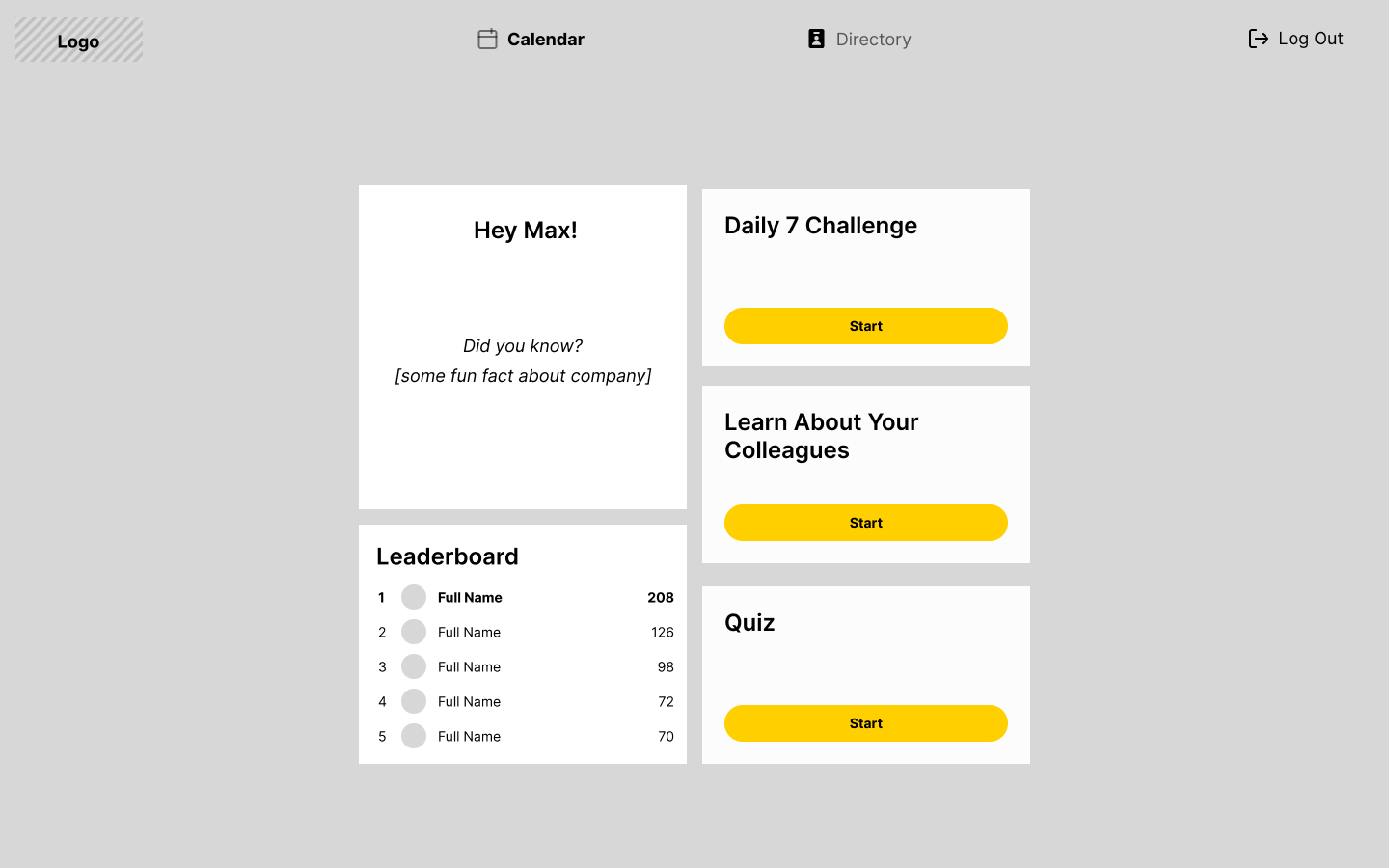
My education with psychology background came in handy, as it is known humans retain information better in smaller chunks. One common principle is Miller's law of 7±2 - humans have a short-term memory of 7/5/9 items at one given time. The "Daily 7" app feature merges the original card sorting activity with the 7±2 span to optimize retention and recognition rate. It also reduces the cognitive load of picking departments as it picks random 7 employees.


The "Learn" (left below) and "Quiz" (right below) modes were envisioned to be accessed less as it requires more learning initiative from the user. The two are connected as the user can access the Quiz after completing learning with the same set of profile cards, however, it is not a necessary step for the Quiz flow.
The Quiz is especially interesting as it allows learning to happen as you complete it. If you don't know the answer, you can tap "I don't know" to reveal the hint and continue. Additionally, I wanted more reinforcement in the score screen by letting the user revisit all 7 faces with all the details and audio recordings. Proximity and association is one of key principles of grouping and remembering several bits of information together.


If you don't complete the quiz, you can pick up at any point from the Home tab. Adding the top space with a quick CTA and illustration would grab the user's utmost attention as Home will be visited the most. Unlockable milestones were also suggested to motivate Max to increase the number of people he can recognize in his large company. It's a fun familiar experience in any game which would not require any additional learning to understand.

For a responsive web application, I thought it best to take a modular mobile-first approach. Although the features were easy to scale up to desktop view, I struggled to conclusively finalize the layout of the Home tab and I raised this concern during the review. Adding some fun facts about the company or featured employee, tracking the progress and better utilizing the space given would have enhanced the desktop experience in ways that mobile view may not be able to achieve.
During the full team review, one key feedback from the team was the new app's stickability. The achievements do provide motivation, but they are arbitrary and may not be sustainable in long-term. For instance, what would motivate a seasoned employee to use this app once they learn most and won't notice if there are any newcomers. Additionally, from the development perspective, there were concerns over putting the navigation at the bottom in mobile view and the top in desktop view and what information can be reliably pulled from BambooHR APIs (Mindgrub's current HR platform).
The dev team surprisingly suggested us to go beyond the original app boundaries. The purpose to learn more about your co-workers remained, however, the approach changed. For the first working iteration I had two features that I wanted to focus on. A rough sketch of the flow for Onboarding and Calendar/Home helped me list out the screens I would have needed at the minimum.

Firstly, for a newcomer, a compelling onboarding experience would ease their nerves - something that is practical but not overwhelming in written text and corporate jargon. Incorporating a mobile responsive approach, I wanted to simplify the onboarding by breaking it down into small simple sections - a greeting, where the newcomer is in relati. The user's profile would be at the center to highlight how everyone else introduced later on is relevant to them specifically.

I felt stuck as companies can have different structures — be it a top-down hierarchy, horizontal structure etc. (Williams, n.d.). When discussing this block, my mentor recommended Hoos Hoo's design team to conduct a 1-hour brainstorming workshop to bring in new, fresh perspectives from other designers in Mindgrub.
Looking at all of our sketches, there were significant differences in the layout, how each component connected to another. Yet, there was a clear common ground that aligned with my original wireframes - the user is always at the center, either through animations or static placement. I particularly liked the centered line proposed by an "outsider" (interactive designer, far right) as it would not disrupt the natural vertical page scrolling and adopted following iterations based on his sketch. Although a newcomer wants to know those most relevant to their workday, being aware of other people like their supervisor's peers or who their supervisor reports is also reflected in several sketches (click the image below to compare sketches to final design).

Tests took place after the final design for the first iteration was completed by the interactive designer, whom I worked with closely for this and other projects at Mindgrub. By the time the tests were being conducted, the developers were already halfway building the actual web application. Therefore, Joanne and I built together a hi-fi Figma prototype for the usability tests. Not ideal for any significant changes, which we raised during team stand-up. Our mentors were sympathetic but were constrained by the timeline of the sprints. As a UX designer, we can advocate the best way we can for user's needs.
For the task-based test, I wanted to focus on retention rate, as onboarding was especially designed to separate information into smaller chunks with an opportunity for reinforcement (2-question quiz). However, testing this proved to be difficult in the time constraints given (30 minute sessions). Instead, the final test script focused on qualitative data collection - how the users interpret what they see, their attitudes and feelings towards the experience of onboarding and using the calendar during the work week to prepare for meetings.
As the company was remote-first, the tests were conducted through recorded Zoom calls and notes were taken for data analysis. We focused on the desktop prototype as we felt it would be most organic to the experience as the users accessed the prototype on their computers. I used BambooHR to compile a list of 5 employees through stratified sampling - all Mindgrub employees from different departments and roles with different tenures at the company. For ethical reasons, the identities are blurred and the recordings are not accessible to the public, but here are some screenshots (click the image to see the whole deck)!

The full breakdown of the test findings and recommendations can be found here. However, I wanted to bring attention to some highlights that particularly informed the next section:
Overall, I was satisfied of the work we've produced. However, it could be improved even more in future iterations.
1. Users had mixed responses to the question regarding the log-in details despite the prompt to use their work email credentials in the e-mail screen. Perhaps, adding helper text by default for the log-in credentials can reduce the room for error. Although the password reset would not be done through Hoos Hoo, users expected some sort of help line in case they forget.
A simple text link is a familiar UX pattern. It would depend on back-end considerations, but it could let the user automatically reset their password through the work email website or at least provide contact info for IT Desk or HR department.

2. Clarify why an element is on the screen. The down arrow's function as a non-interactive sign to scroll down could be made more apparent with a simple, friendly up-down animation. Also, majority of users attempted to click on the cards in the Event Details modal - the next iteration could expand Hoos Hoo's features by integrating attendee's profile access and contact info when clicking on their card.

3. The people introduced during onboarding were directly related to the employee. Yet, the secondary profile "bubbles" floated aimlessly. Perhaps, the layout should be more streamlined to better indicate that they are the supervisor's peers. At the very least, their role will be clearer with a hover state that reveals their name and job title as well.
4. Make it easier to undo or go back - users found the quiz to be a fun activity and would have liked to be able to revisit it after completion should they wish. Similarly, when completing the quiz they would have liked to go back to the onboarding page to better familiarise themselves with their co-workers.
5. Optimizing the calendar as a Google calendar replacement - adding the day/week view toggle would ensure the user can see all their upcoming events as they tackle each work day. A FAB for adding an event would be in line with remote users' daily tasks. Additionally, for any meeting, you want to prioritize learning about attendees confirmed to be there - grouping attendee cards by attendance could be a solution.
The website's features changed drastically to be more useful and helpful. Hoos Hoo has transformed from a simple card sorting game to a comprehensive HR managing tool for new and seasoned employees' needs.
Although the devs were encouraging throughout to give me as much room as they can and even pushing for more features, there were back-end limitations as well. I learnt a lot about which information can be reliably extracted from BambooHR and a little about APIs.
Apart from basic profile details, email and phone number, admins would have needed to input manually for each employee. The budget did not include any resources for storing and tracking user information, therefore tracking their progress in-between sessions would have been tricky and possibly detrimental to the flow. Adding "fun facts", as previously mentioned, could have really elevated the Directory and employees' profiles to be a delightful feature. Yet, despite the limitations, I feel Hoos Hoo is finally going in the right direction to be sold as a plug-in feature of a larger HR platform like BambooHR.

Additionally, a notable absence here is user settings, which due to development constraints had to be removed. Admin control was initially explored as contained inside the app but the meeting concluded that it would be easier to set up a separate admin portal. It would have definitely been an interesting feature for the log-in screen!

Towards the end of the project, as I was completing the design review, the casual discussions between myself and Joanne raised interesting issues. We both felt Hoos Hoo could be even more usable with broader integration as a one-stop shop for a Mindgrubber's work flow. For example, currently Mindgrub employees need to clock in their hours through Harvest - it syncs with their Google calendar to easily input existing meetings into their timesheets. But what if Hoos Hoo could integrate Harvest's timesheets to add hours inside the web application?

